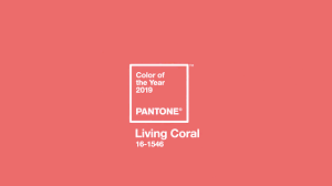
Pantone Colour of the Year 2019
PANTONE® 16-1546 Living Coral
Life affirming coral hue energizes and enlivens with a softer edge
CARLSTADT, N.J., December 6, 2018 –
Pantone, provider of professional colour standards and digital solutionsfor the design industry, today announced PANTONE 16-1546 Living Coral as the Pantone Colour of the Year 2019, an animating and life-affirming shade of orange with a golden undertone. We get energy from nature. Just as coral reefs are a source of sustenance and shelter to sea life, vibrant yet mellow PANTONE16-1546 Living Coral embraces us with warmth and nourishment to provide comfort and buoyancy in our continually shifting environment.

In reaction to the onslaught of digital technology and social media increasingly embedding into daily life, we are seeking authentic and immersive experiences that enable connection and intimacy. Sociable and spirited, the engaging nature of PANTONE 16-1546 Living Coral welcomes and encourages light-hearted activity. Symbolizing our innate need for optimism and joyful pursuits, PANTONE16-1546 Living Coral embodies our desire for playful expression.
Representing the fusion of modern life, PANTONE Living Coral is a nurturing colour that appears in our natural surroundings and at the same time,displays a lively presence within social media. “Colour is an equalizing lens through which we experience our natural and digital realities, and this is particularly true for Living Coral,” said Leatrice Eiseman, Executive Directorof the Pantone Colour Institute. “With consumers craving human interaction and social connection, the humanizing and heartening qualities displayed by the convivial Pantone Living Coral hit a responsive chord.”
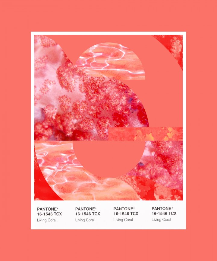
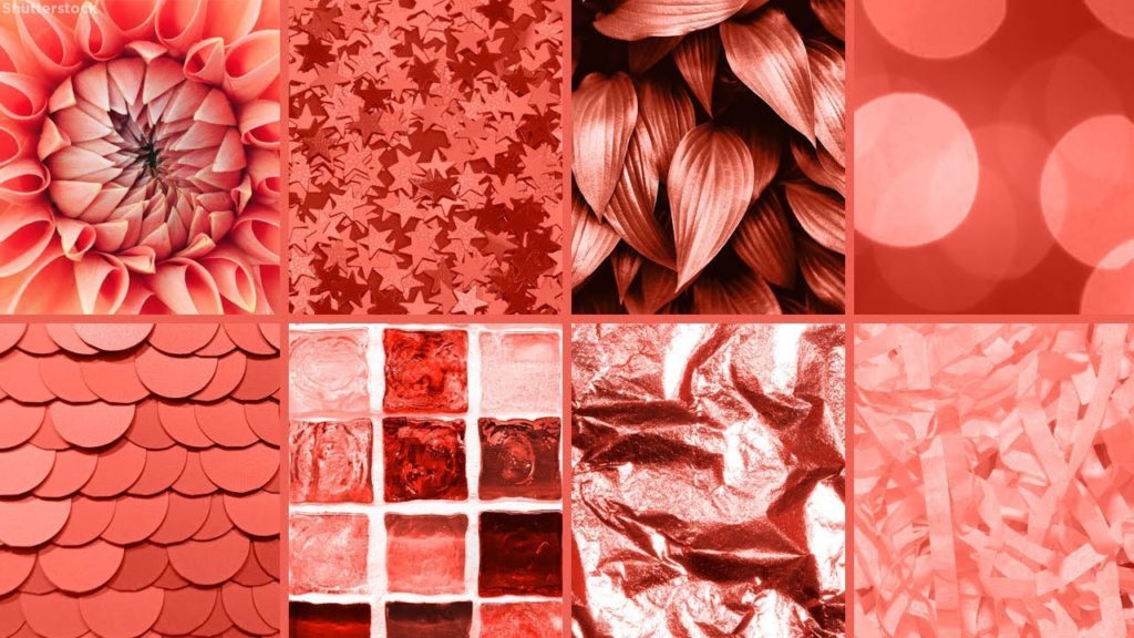
PANTONE 16-1546 Living Coral emits the desired, familiar and energizingaspects of colour found in nature. In its glorious, yet unfortunately moreelusive, display beneath the sea, this vivifying and effervescent colour mesmerizes the eye and mind. Lying at the centre of our naturally vivid and chromatic eco system, PANTONE Living Coral is evocative of how coral reefs provide shelter to a diverse kaleidoscope of colour.
“Colour enhances and influences the way we experience life,” said Laurie Pressman, Vice President of the Pantone Colour Institute. “As a shade that affirms life through a dual role of energizing and nourishing, PANTONE 16-1546Living Coral reinforces how colours can embody our collective experience and reflect what is taking place in our global culture at a moment in time.”
In Social Media
An organic shade, Living Coral is striking in digital mediums, evoking the same inspirational feeling ignited by our natural surroundings. Living Coral’s vibrancy and buoyancy captivates our attention in social media and digital design.
In Fashion and Accessories
Living Coral inspires experimentation and playful expression in both men’s and women’s street and runway styles. The warm shade suggests comfort and positivity in simple colour stories, but becomes more explorative and effervescent in patterns, textures and even monochrome looks. An appealing accent shade, PANTONE Living Coral provides a striking contrast across the colour spectrum.
In Beauty
As a life-affirming hue that complements all skin tones, PANTONE Living Coral brings natural colour to beauty in blush, eye and lip. Uninhibited,playful looks are also emboldened by Living Coral, which, as the centre of a kaleidoscope of colour, encourages experimentation in beauty with palettes,textures, shimmers and sheens.
In Product Design
Living Coral is naturally suited for products across all ages and genders. Materials with texture and convivial colours such as PANTONE 16-1546 Living Coral appeal to our desire for products exhibiting humanizing and heartening characteristics.
In Interior Décor and Furnishings
When used as a bold statement in settings and décor, Living Coral fosters immersive experiences such as pop-up installations and interactive spaces, tied to a playful spirit. As a colour linked to tactility and human connection, PANTONE Living Coral in shag rugs, cosy blankets and lush upholsteries create a warm, comforting and nurturing feeling in the home. With its ebullient nature, PANTONE Living Coral adds a dramatic pop of colour to any room setting whether in decorative accessories, table top, or on the wall.
In Packaging Design
Living Coral is naturally ideal for packaging applications. Warm and welcoming, this life affirming shade invites us to reach out and touch.
Adobe Stock x Pantone Colour of the Year 2019
For the second year in a row, Pantone has partnered with Adobe Stock to offer a curated Colour of the Year collection to inspire and assist the creative community. Living Coral illustrates a natural, yet dynamic and energizing tone that is perfect for designers across verticals looking to energize and enliven creative elements with a softer edge. With more than 125 million visual assets, Adobe Stock is an amazing resource for creatives to seek visual inspiration and creative development.
Material ConneXion & Pantone
Across the Design industry, effectively bringing PANTONE 16-1546 Living Coral to life in product design requires consideration of both colour and the material to which it will be applied. To underscore the relationship between colour and material and increase efficiencies within the design process, Pantone has partnered with Material ConneXion, a global materials and innovation consultancy. By working with Material ConneXion, designers and suppliers can source the solutions that will meet consumer demands and deliver on their design vision while also supporting their business.
Limited Edition Pantone Colour of Year 2019 Guides
In celebration of the 20th anniversary of the Pantone Colour of the Year announcement, special collections of Pantone Formula Guides and Fashion, Home+Interiors Colour Guides will be available for a limited time. Guides will feature commemorative Colour of the Year covers, information on the 2019 selection and history of past Colours of the Year enclosed within the guide.
Pantone Colour of the Year 2019 Formula Guides for graphic, print and packaging designers and Fashion, Home + Interiors Colour Guides for fashion and product designers, are available in limited quantities from Pantone.com and through authorized distributors worldwide.
About the Pantone Colour of the Year
The Colour of the Year selection process requires thoughtful consideration and trend analysis. To arrive at the selection each year,Pantone’s colour experts at the Pantone Colour Institute comb the world looking for new colour influences. This can include the entertainment industry and films in production, traveling art collections and new artists, fashion, all areas of design, popular travel destinations, as well as new lifestyles, play styles, and socio-economic conditions. Influences may also stem from new technologies, materials, textures, and effects that impact colour, relevant social media platforms and even up-coming sporting events that capture worldwide attention. For 20 years, Pantone’s Colour of the Year has influenced product development and purchasing decisions in multiple industries, including fashion, home furnishings, and industrial design, as well as product, packaging and graphic design. Past selections for Colour of the Year include:
- PANTONE 18-3838 Ultra Violet (2018)
- PANTONE 15-0343 Greenery (2017)
- PANTONE 15-3919 Serenity and PANTONE 13-1520 Rose Quartz (2016)
- PANTONE 18-1438 Marsala (2015)
- PANTONE 18-3224 Radiant Orchid (2014)
- PANTONE 17-5641 Emerald (2013)
- PANTONE 17-1463 Tangerine Tango (2012)
- PANTONE 18-2120 Honeysuckle (2011)
- PANTONE 15-5519 Turquoise (2010)
- PANTONE 14-0848 Mimosa (2009)
- PANTONE 18-3943 Blue Iris (2008)
- PANTONE 19-1557 Chili Pepper (2007)
- PANTONE 13-1106 Sand Dollar (2006)
- PANTONE 15-5217 Blue Turquoise (2005)
- PANTONE 17-1456 Tigerlily (2004)
- PANTONE 14-4811 Aqua Sky (2003)
- PANTONE 19-1664 True Red (2002)
- PANTONE 17-2031 Fuchsia Rose (2001)
- PANTONE 15-4020 Cerulean (2000)
The colour selected as our Pantone Colour of the Year 2019 was taken from the Pantone Fashion, Home + Interiors Colour System, the most widely used and recognized colour standards system for fashion, textile, home, and interior design.
For more information on the Pantone Colour of the Year for 2019, please visit www.pantone.com/color-of-the-year-2019.
(646) 442 5957 | Pantone@KWTGlobal.com