Pantone Colour of the Year 2022
ANNOUNCING THE PANTONE COLOR OF THE YEAR 2022
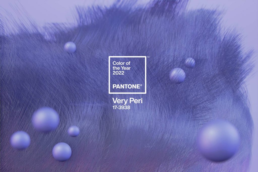
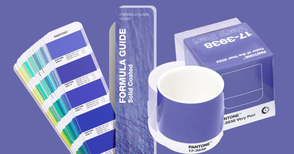
PANTONE 17-3938 Very Peri
A New Pantone Colour Whose Courageous Presence Encourages Personal Inventiveness And Creativity
Displaying a carefree confidence and a daring curiosity that animates our creative spirit, inquisitive and intriguing PANTONE 17-3938 Very Peri helps us to embrace this altered landscape of possibilities, opening us up to a new vision as we rewrite our lives. Rekindling gratitude for some of the qualities that blue represents complemented by a new perspective that resonates today, PANTONE 17-3938 Very Peri places the future ahead in a new light.
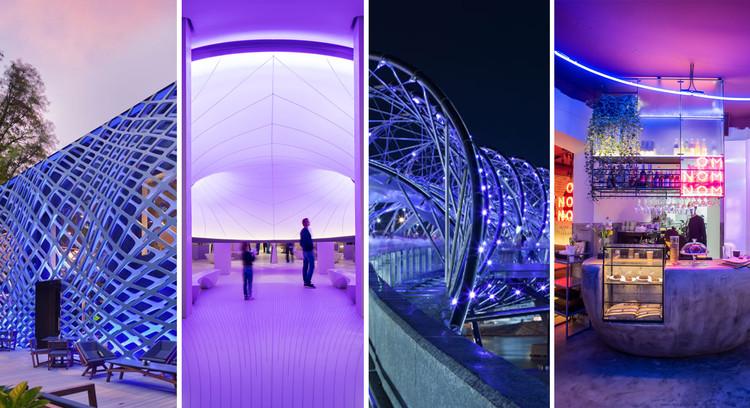
We are living in transformative times. PANTONE 17-3938 Very Peri is a symbol of the global zeitgeist of the moment and the transition we are going through. As we emerge from an intense period of isolation, our notions and standards are changing, and our physical and digital lives have merged in new ways. Digital design helps us to stretch the limits of reality, opening the door to a dynamic virtual world where we can explore and create new colour possibilities. With trends in gaming, the expanding popularity of the metaverse and rising artistic community in the digital space PANTONE 17-3938 Very Peri illustrates the fusion of modern life and how colour trends in the digital world are being manifested in the physical world and vice versa.
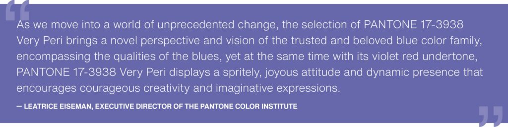
“The Pantone Colour of the Year reflects what is taking place in our global culture, expressing what people are looking for that colour can hope to answer.” added Laurie Pressman, Vice President of the Pantone Colour Institute. “Creating a new colour for the first time in the history of our Pantone Colour of the Year educational colour program reflects the global innovation and transformation taking place. As society continues to recognize colour as a critical form of communication, and a way to express and affect ideas and emotions and engage and connect, the complexity of this new red violet infused blue hue highlights the expansive possibilities that lay before us”.
Encompassing the qualities of the blues, yet at the same time possessing a violet-red undertone, PANTONE 17-3938 Very Peri displays a spritely, joyous attitude and dynamic presence that encourages courageous creativity and imaginative expression.
ABOUT PANTONE COLOuR OF THE YEAR
The Pantone Colour of the Year selection process requires thoughtful consideration and trend analysis. To arrive at the selection each year, Pantone’s colour experts at the Pantone Colour Institute™ comb the world looking for new colour influences. These can include the entertainment industry and films in production, traveling art collections and new artists, fashion, all areas of design, popular travel destinations, as well as new lifestyles, playstyles, and socio-economic conditions. Influences may also stem from new technologies, materials, textures, and effects that impact colour, relevant social media platforms and even upcoming sporting events that capture worldwide attention. For 23 years, Pantone’s Colour of the Year has influenced product development and purchasing decisions in multiple industries, including fashion, home furnishings and industrial design, as well as product packaging and graphic design.
ABOUT PANTONE COLOR INSTITUTE™
Pantone Colour Institute is the business unit within Pantone that highlights the top seasonal runway colors, selects the Pantone Colour of the Year, forecasts global colour trends, and advises companies on colour for product and brand visual identity. Through seasonal trend forecasts, colour psychology, and colour consulting, Pantone Colour Institute partners with global brands to effectively leverage the power, psychology, and emotion of colour in their design strategy.
Article Credit : https://www.pantone.com/color-of-the-year-2022
December 2021