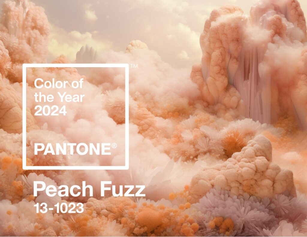
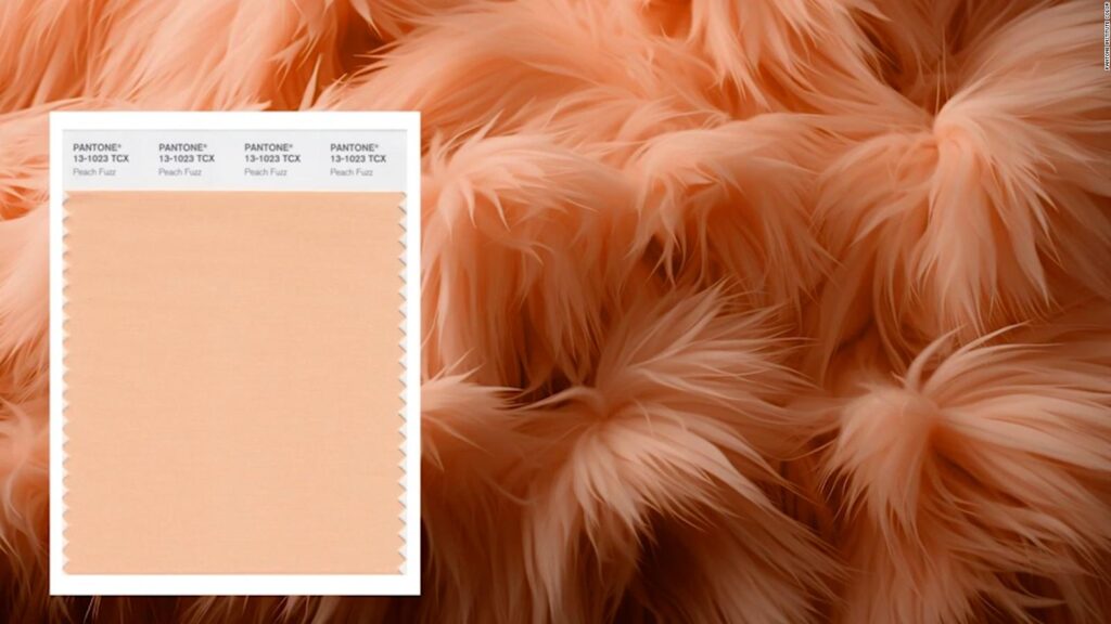
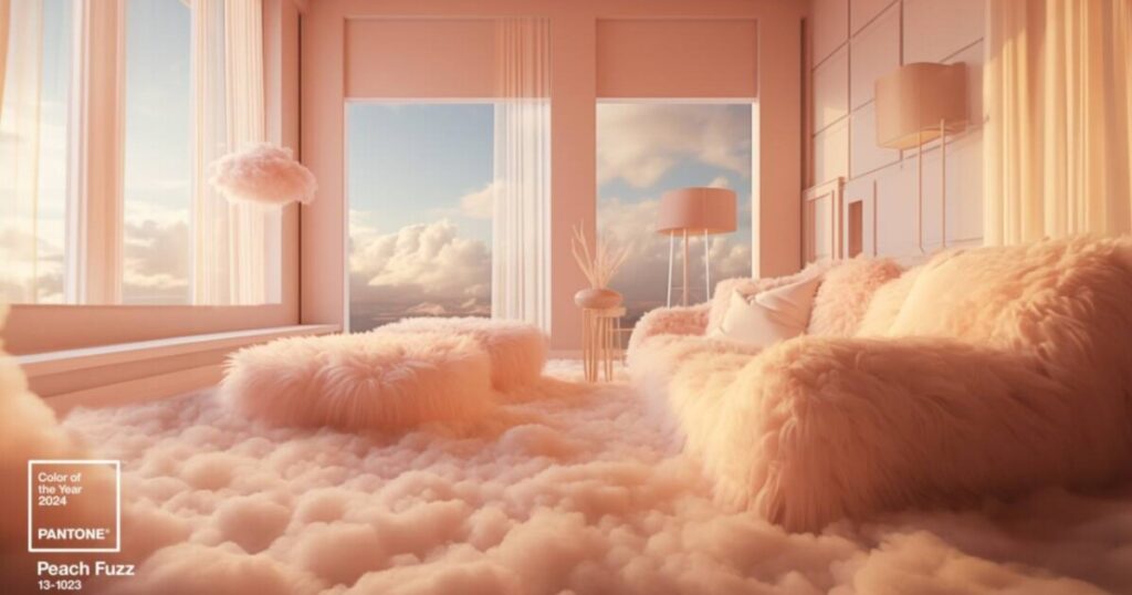
Pantone Colour of the Year 2024
How Does Pantone Select the Pantone Color of the Year?
An Interview with Laurie Pressman, Vice President of the Pantone Color Institute
Laurie, talk about why and how this process began. When did Pantone Colour of the Year start?
The Pantone Colour Institute originally created the Pantone Colour of the Year educational program in 1999 to engage the design community and colour enthusiasts around the world in a conversation around colour. We wanted to draw attention to the relationship between culture and colour — to highlight to our audience how what is taking place in our global culture is expressed and reflected through the language of colour.
In 2024, Pantone Colour of the Year turns 25. Do you have any thoughts on this? How has its legacy grown in the last 25 years?
Through the years the Pantone Colour of the Year program has become a globally iconic cultural touchstone, capturing the imagination of so many designers, brands, and consumers.
As we celebrate the 25th year of our Pantone Colour of the Year program and the fundamental role colour plays in our shared human experience, it is our hope that we have inspired you to look at colour in a different way — that colour and its connection to emotion and the expression of human feelings will take on a new significance, causing your eye to linger a little longer throughout the day on the tints and tones that surround you, as history unfolds from moment to moment.
Since we introduced PANTONE 15-4020 Cerulean Blue as the first Pantone Colour of the Year in 1999, we have seen this program influence product development and purchasing decisions in nearly every industry and country around the world. Growing in popularity each year, its impact is felt across fashion, colour cosmetics, home furnishings, automotive and industrial design, as well as product, packaging, multimedia design, and commercial interiors. We are grateful to have provided an avenue where designers and colour enthusiasts all over the world feel empowered to tell their own stories through the language of colour and showcase their creativity within their communities. We look forward to continuing this for many more years to come.
Who decides the Pantone Colour of the Year?
To arrive at the selection each year, our team of global colour experts at the Pantone Colour Institute comb the world looking for new colour influences. This can include the entertainment industry and films in production, traveling art collections and new artists, fashion, all areas of design, aspirational travel destinations, new lifestyles, playstyles, or enjoyable escapes, as well as socio-economic conditions. Influences may also stem from new technologies, materials, textures, and effects that impact colour, relevant social media platforms, and even upcoming sporting events that capture worldwide attention.
Anything and everything taking place in our culture during the year can influence our Pantone Colour of the Year selections, with each source carrying a different weight from year to year depending on what’s taking place in our culture at that time. For example, if you look back to 15 years ago, technology would have played an infinitesimal role. Today that is no longer the case. Gaming, social media, augmented and virtual reality, and physical design itself are all influenced by our technology and the colours we can access in the digital environment.
How does the selection process work? How does Pantone decide the Colour of the Year every year?
The Pantone Colour of the Year selection process entails thoughtful consideration and trend analysis. It is a culmination of the macro-level colour trend forecasting and research that the global team involved with the Pantone Colour Institute conducts year-round that informs this selection, as well as the colours that get included into our colour trend forecasting products.
We approach our colour selection in a very pure way. No one on our global team comes to any Pantone Colour of the Year discussion with a commercial agenda or personal preferences. Instead, we each approach our Pantone Colour of the Year colour selection in a very pure way. As we like to say, “we love all of our colours equally.”
There’s also a misconception that we gather a bunch of colour influencers in a room one day and emerge with the decision. As many of our Pantone Colour Institute team members own their own design studios, contribute to key influential global trend forecasts, work with clients prescribing colour choices for brand or product visual identity, and even teach classes on colour, their daily conversations are rooted in colour and design, including material and surface finish.
As a result, conversations relating to the Pantone Colour of the Year selection do not take place in one isolated meeting at a specific time of year. It is one long, continuously flowing conversation among a group of colour-attuned people. Our Pantone Colour Institute team members come from a wide range of design, cultural, and geographical backgrounds. The commonality that brings them together is their expertise in colour and design, and their ability to see the world through the lens of colour. That’s why I liken them to being colour anthropologists. They have this intuitive ability to connect all that is taking place in the world and translate it into the language of colour.
What’s especially fascinating to me about the Pantone Colour of the Year selection process is that although our Pantone Colour Institute members reside in disparate locations and are involved in differing areas of design, we are always able to come to a consensus.
Sure, there are different perspectives that come up and we carefully look at them all, but because the Pantone Colour of the Year reflects what is taking place in our global culture at that moment in time, many of our observations and what we see visually showing up can be quite similar. We discuss our colour psychology and colour trend research as we look to connect the mood of the global zeitgeist with the corresponding colour family. From there, we drill down further to identify the exact right shade.
It is always a challenging process and sometimes we need to look at alternative ways to express our colour message. For Pantone Colour of the Year 2016 and Pantone Colour of the Year 2021, we brought together two colours to tell our story.
PANTONE Colour of the Year 2016 was a blend of two shades, PANTONE 13-1520 Rose Quartz and PANTONE 15-3919 Serenity, that came together to reflect connection and wellness as well as convey a soothing sense of order and peace.
For Pantone Colour of the Year 2021, our two independent colours, PANTONE 17-5104 Ultimate Gray + PANTONE 13-0647 Illuminating, highlighted how different elements come together to support one another.
And, for the first time for our Pantone Colour of the Year selection in 2022, PANTONE 17-3938 Very Peri, we created a brand new colour as we did not have the exact right colour we needed to convey the message.
We also consider the colour name in our selection process as names immediately conjure up an image and a feeling. We want to make sure that the name of our Pantone Colour of the Year resonates and can easily and intuitively convey the message we are looking to send.
What does the selection of the Pantone Colour of the Year represent?
The colour we select to be our Pantone Colour of the Year is bigger than one region or one sector of design. It is a colour we see crossing all areas of design — a colour that serves as an expression of a mood and an attitude on the part of consumers, a colour that will resonate around the world, a colour that reflects what people are looking for, a colour that can hope to answer what people feel they need.
That’s the difference between a more short-lived fad and a lifestyle trend. Pantone Colour of the Year is reflective of a lifestyle trend. It’s about what’s happening in the zeitgeist at a macro level. It’s not going to represent a singular trend that you can only find in the US or only find in Asia. It’s global.
The emotional aspect of colour is also a large aspect of our decision making. We want to ensure that the colours we select reflect what is taking place in our global culture at a specific moment in time. With colour and context so intertwined, there really are reasons why a colour family or individual colour comes into prominence when it does. For the most part, the popularity of a colour is symbolic of the age we live in. So, while each year is unique, and we look at each year separately, we also do look back to where we have been since we began this program in 1999.
Why does Pantone pick the Colour of the Year? In other words, what makes the Pantone Colour Institute the global authority on colour?
Pantone is in the business of colour. Since 1963, Pantone has provided colour solutions for all our client’s colour needs. Today, Pantone’s colour language is used by designers worldwide to access colour trends, communicate colour choices, and control consistency of colour across every imaginable surface, texture, material, and finish.
Founded in 1985, the Pantone Colour Institute educates, inspires, and promotes fluency in the language of colour. Executive Director Leatrice Eiseman, who helped to start the Pantone Colour Institute, has a background in colour, design, and psychology. The ongoing colour preference study research which she conducts through the Pantone Colour Institute serves as the foundation for who we are and all that we do.
Why is Pantone Colour of the Year important? When the program is successful, what happens to the world?
It’s important to remember that the goal of the program isn’t to promote one particular colour, although we do see that colours we select to be our Pantone Colour of the Year increase in popularity, and once integrated into the cultural mindset, become even more influential the following year.
The goal of the program is to help companies and consumers better understand the power colour can have. We want to highlight colour’s role as a silent language to teach them how to leverage colour’s power and expressiveness to influence perception — whether it be to create a more successful design strategy that will increase consumer engagement, or to better showcase your own personal identity.
For companies, Pantone Colour of the Year demonstrates that colour is a major part of a consumer’s decision to buy something or not. For consumers, it makes them conscious of the impression they can make through colour. On any given day, the colours you choose to wear affect your mood and how you want others to perceive you. Colour is an important part of the message you send to the world.
Colour is our most important powerful communication tool. It is the first thing we see and the first thing we connect to. It is a visual language we all understand, one whose message crosses genders, generations, and geographies.
Learning more about the unique meanings particular colours give voice to helps us to be a more expressive, closely connected society, one that provides people with a more holistic understanding of their peers and communities alike. As a globally recognized visual language, colour can say what words cannot.
https://www.pantone.com/articles/color-of-the-year/choosing-the-pantone-color-of-the-year –
Article Credit : Laurie Pressman
Vice President, Pantone Color Institute™ – December 7, 2023