Bold colours to bring into the workplace
It should come as no surprise that bold colour – any colour, for that matter – has a tremendous impact on mood. As Carl Jung put it, “colours express the main psychic functions of man.” And when it comes to an office environment, the impact of striking colour becomes even more powerful. A splash of a bright hue on the wall, floor, or desk can mean the difference between a successful brainstorming session and an unproductive one; it can boost an employee’s confidence before a big meeting; and it can even make workers more detail-oriented. And that’s just to name a few of the potential outcomes.
However, each colour produces a different psychological response, and it’s important to learn the nuances between them to ensure that you’re getting all the benefits.
Here’s a look at what bold colour can do for your workplace – and some dramatic examples from recently-completed offices that are nailing it.
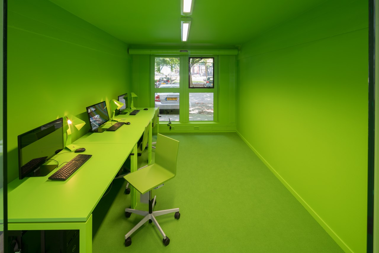
Green for productivity
Green is linked to broad, creative thought, according to a Forbes interview with environmental psychologist and Design With Science founder Sally Augustin. “‘There seems to be a positive association between nature and regrowth,’ notes Augustin. So if you want your employees to be more productive, consider painting work areas green.”
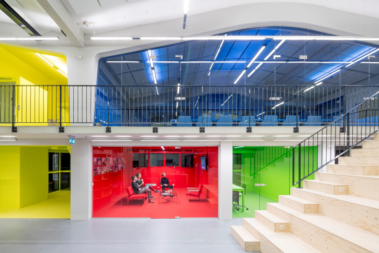
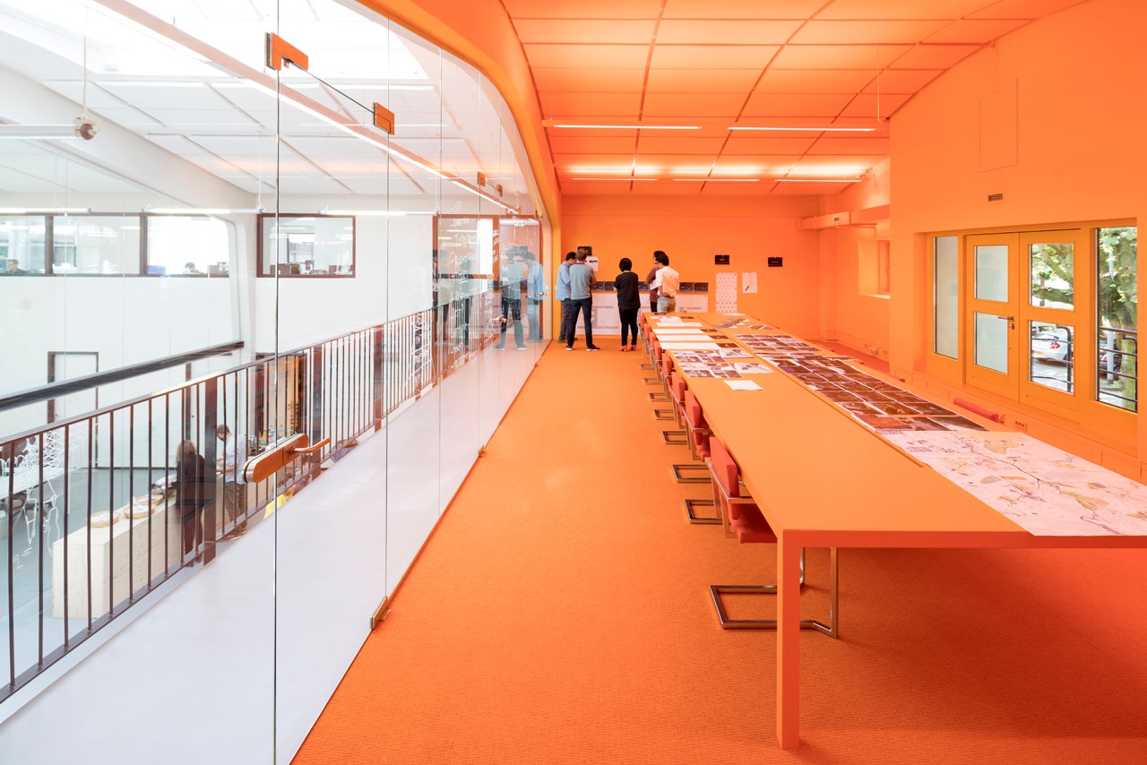
For its Rotterdam office, architecture firm MVRDV created a 2,400 square metre complex (shown above) with colour-coded meeting rooms, including a huge conference room in orange, a presentation room in dark blue, and, for those productive moments, a quiet working room in green.
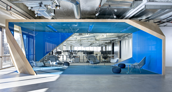
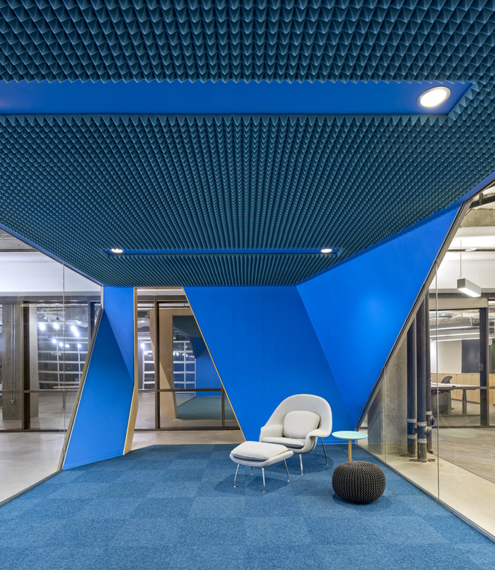
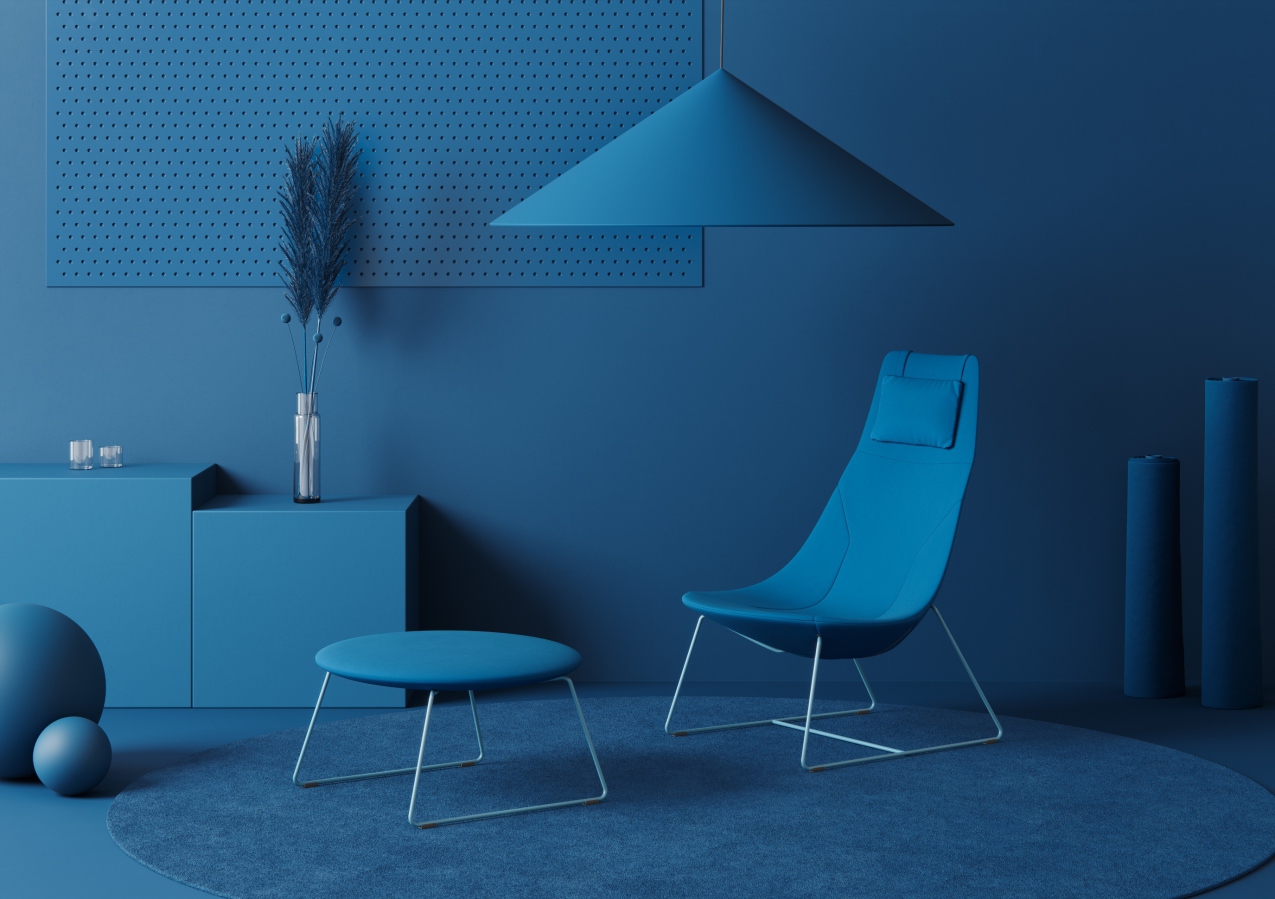
Blue for creative tasks
According to a University of British Columbia study, the colour blue is suited specifically to creative tasks, like brainstorming. “Through associations with the sky, the ocean, and water, most people associate blue with openness, peace and tranquillity,” says study author Juliet Zhu. “The benign cues make people feel safe about being creative and exploratory.”
Software company Venafi used this creative-boosting hue to its advantage when it relocated to a new space in Salt Lake City, which features folded wall volumes delineating the open-concept space. “Our design sought to use humble materials in innovative ways, using geometry and texture to infuse them with content,” says design firm Steven Christensen Architecture.
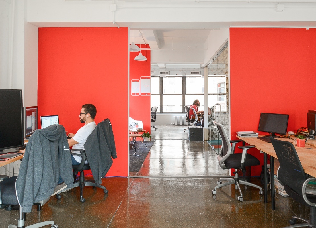
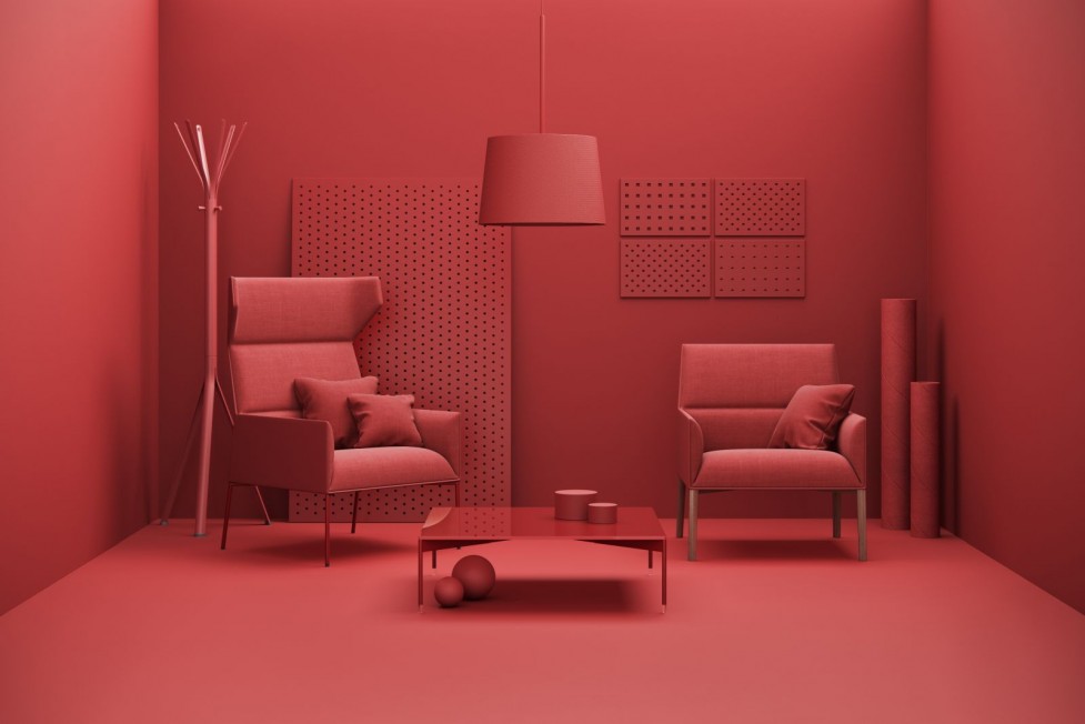
Red for attention to detail
The same University of British Columbia study found that red is ideal for detail-oriented tasks, like proof-reading. “Thanks to stop signs, emergency vehicles and teachers’ red pens, we associate red with danger, mistakes and caution,” says Zhu. “The avoidance motivation, or heightened state, that red activates makes us vigilant and thus helps us perform tasks where careful attention is required to produce a right or wrong answer.”
Red plays a starring role in Appboy’s office in New York. The app marketing start-up’s space, designed by Homepolish, brings in red accents into the desking areas and meeting rooms.
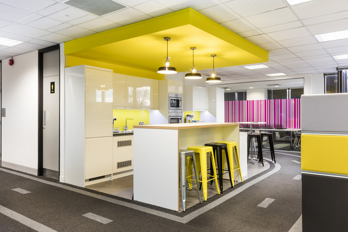
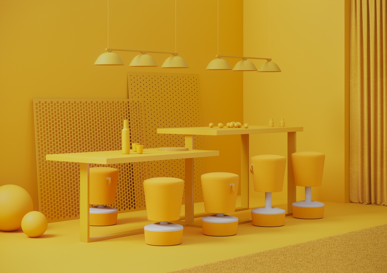
Yellow for decision making
“The right yellow will lift our spirits and our self-esteem; it is the colour of confidence and optimism,” according to British colour therapy consultancy Colour Affects. “Too much of it, or the wrong tone in relation to the other tones in a colour scheme, can cause self-esteem to plummet, giving rise to fear and anxiety.” In short, the right splash of yellow can result in clear-headed and alert employees well-primed for confident decision making.
In consumer panel research company Kantar Worldpanel’s London office, colours (including yellow) were used as a wayfinding tool, indicating various spaces within the building, “so staff could easily navigate around the building and feel more comfortable with their surroundings,” says design studio Peldon Rose.
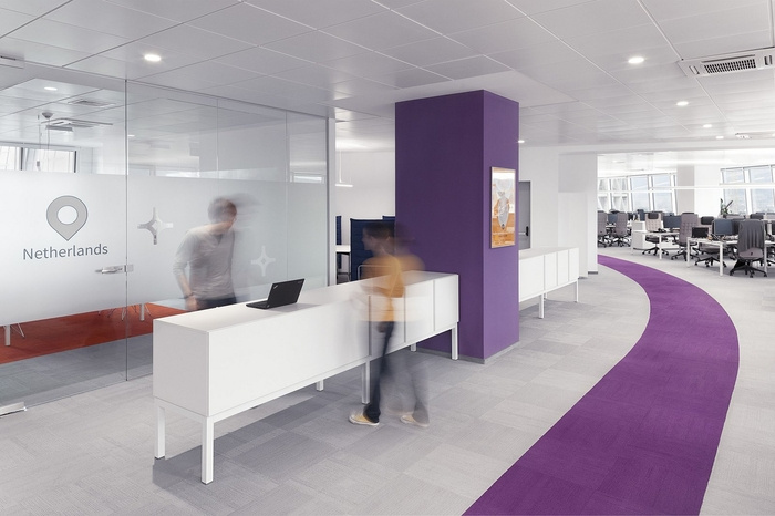
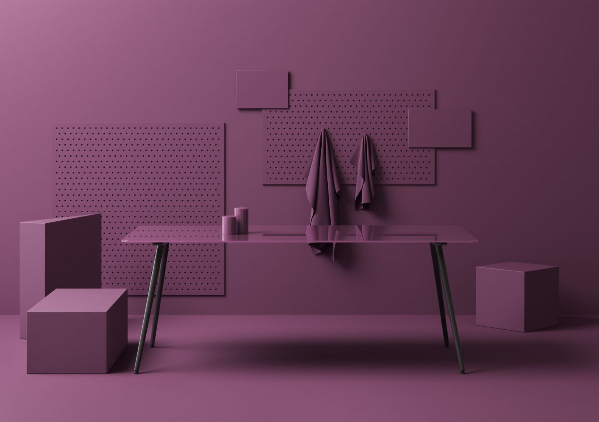
Purple for good impressions
“People link a grayish violet with sophistication,” writes Augustin in an article for Psychology Today. “So it can be a good selection for places where you’re trying to make the ‘right’ impression.” Colour Affects agrees, saying “it has associations with royalty and usually communicates the finest possible quality.”
With these psychological implications, it seems like a no-brainer to incorporate purple into office design. For Paysafe’s Bulgaria office by Cache Atelier, the bold colour adorns the flooring and columns of a section of the otherwise pared-back workspace area.
In short, with a little know-how, bringing bold colour into the workplace can be a fun – and productive – initiative.
Profim at Orgatec 2018
ORGATEC is the world’s leading trade fair for office and real estate equipment. It takes place every two years. Its beginnings date back to 1953, and today it is a very prestigious event that promotes several hundred exhibitors from various countries. It presents new products, trends, technological possibilities and unique solutions that work well in office spaces.
Last year, the design fair focused on culture@work – a visionary approach to work and Profim took this theme to new heights. The concept #findyourcolour ” Up until now our stand has been rather minimalist, open and in a white colour. This time, in cooperation with Studio Rygalik, we have created a design with a completely different nature, sure to attract the attention of event participants. Be prepared to be surprised with its form, encouraging you to move through a world of saturated, energetic colours”. And Profim delivered in spectacular form.
Sources | Workpolis.com | Officesnapshots.com | mvrdv.nl | Profim.eu