Dezeen Bright and Bold Interiors

Ten bright and bold interiors that make use of colour theory
Jane Englefield | 15 May 2021
For our latest look book we’ve selected ten examples of interiors enlivened by contrasting or analogous hues and colour-blocked walls.
The chosen projects all make use of colour theory, some by using analogous colours – colours that are close or next to each other on the colour wheel – while others use complementary colours, which are on opposite sides of the wheel.
The latter approach is often referred to as colour-blocking, a technique first attributed to Dutch artist Piet Mondrian and which later spread to fashion and interiors.
This is the latest roundup in our Dezeen Look books series providing visual inspiration for the home. Previous articles in the series feature interiors with internal glazing, relaxing courtyards, outdoor seating areas with fire pits and decorative printed wallpaper.
________________________________
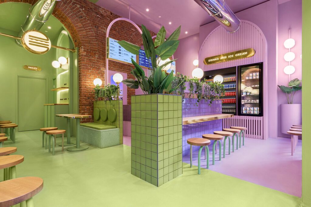
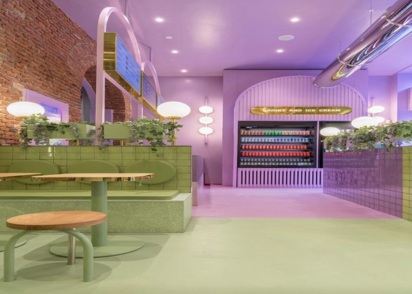
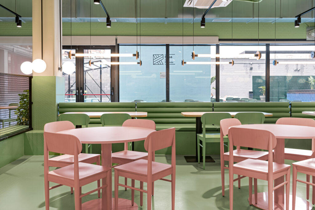
Bun, Italy, by Masquespacio
This Milanese burger restaurant was created by Valencian creative studio Masquespacio, which used a lilac and avocado-green colour scheme to give it a youthful feel.
The colour-blocked interior features two complementary colours which were cleverly used to mark different functions. The purple colour is used for the serving area and the pale green for the restaurant’s dining space.
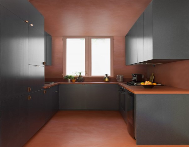
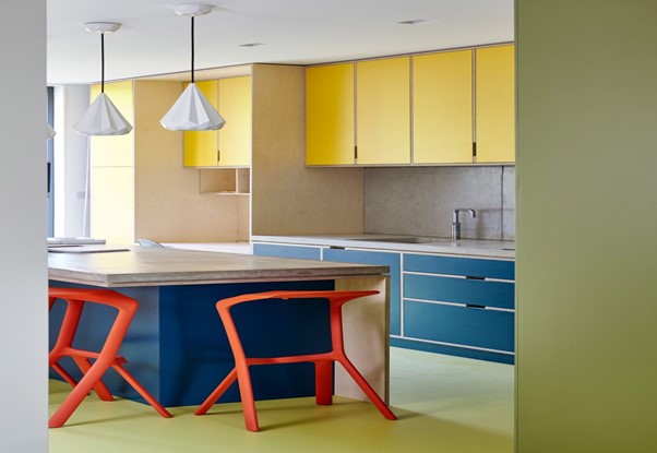
Designed for clients who are “really into colour,” French architect Sophie Dries chose strong colours as the backdrop for this Paris apartment filled with street art.
The kitchen is a mix of grey cabinets and soft orangey-red floors, ceilings, and walls. The designer used the colour-blocking technique of pairing orange with a darker colour but swapped out the blue that is its traditional opposing colour on the wheel for the dark grey hue.
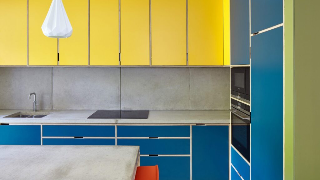
London townhouse, UK, by R2 Studio
R2 Studio transformed this 19th-century terraced house in the London area of Kennington into a set of colourful, light-filled rooms.
The London-based studio wanted to create a spacious and uncluttered living environment, livened up with splashes of blue, orange, yellow and green.
In the kitchen, the studio used colour-blocking by combining complementary bright yellow and bright blue cabinets for an example of how opposing colours can go well together.
Orange Miura bar stools take centre-stage against plainer concrete countertops and match the green colour of the floor and walls for another colour-block touch.
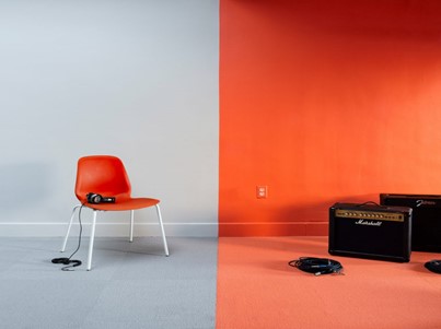
Rooms for Yale University’s student-run radio station, US, by Forma
New York firm Forma used blocks of grey and orange to create colourful spaces in the Yale University rooms that house the student body’s radio station.
Forma painted its recording studio and performance space in segments of grey and vibrant orange, while bright chairs in a similar orange hue nod to the colour theme.
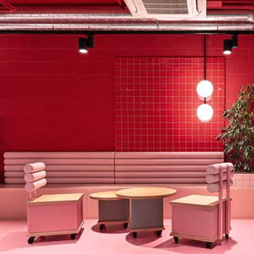
Resa San Mamés student accommodation, Spain, by Masquespacio
Another project by Masquespacio, which designed the interiors for student accommodation in Bilbao with baby pink seating and floors set against dark red walls.
Red and pink are traditionally not used together but instead of clashing, the analogous colours give the room a warm, inviting feel.
Designed as a welcoming community-led environment, the entire Resa San Mamés accommodation featuring various bright shades of colour.
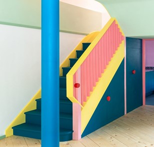
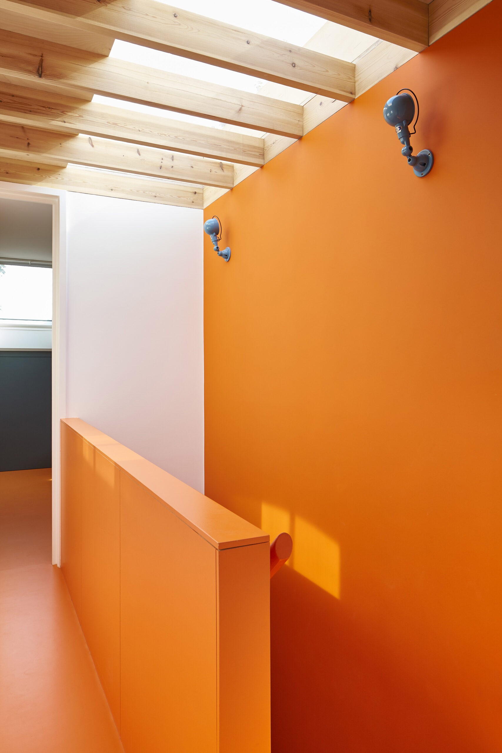
Mo-tel House, England, by Office S&M
This London townhouse by local studio Office S&M features a multicoloured staircase, complete with a bright yellow banister that complements its dark blue hue and is livened up by bold pink accents.
The studio injected an abundance of vivid hues into Mo-tel House, a property with previously dark and cramped spaces in the London area of Islington.
The use of recycled materials led the design of the project, which was completed for a client who works in sustainable fashion.
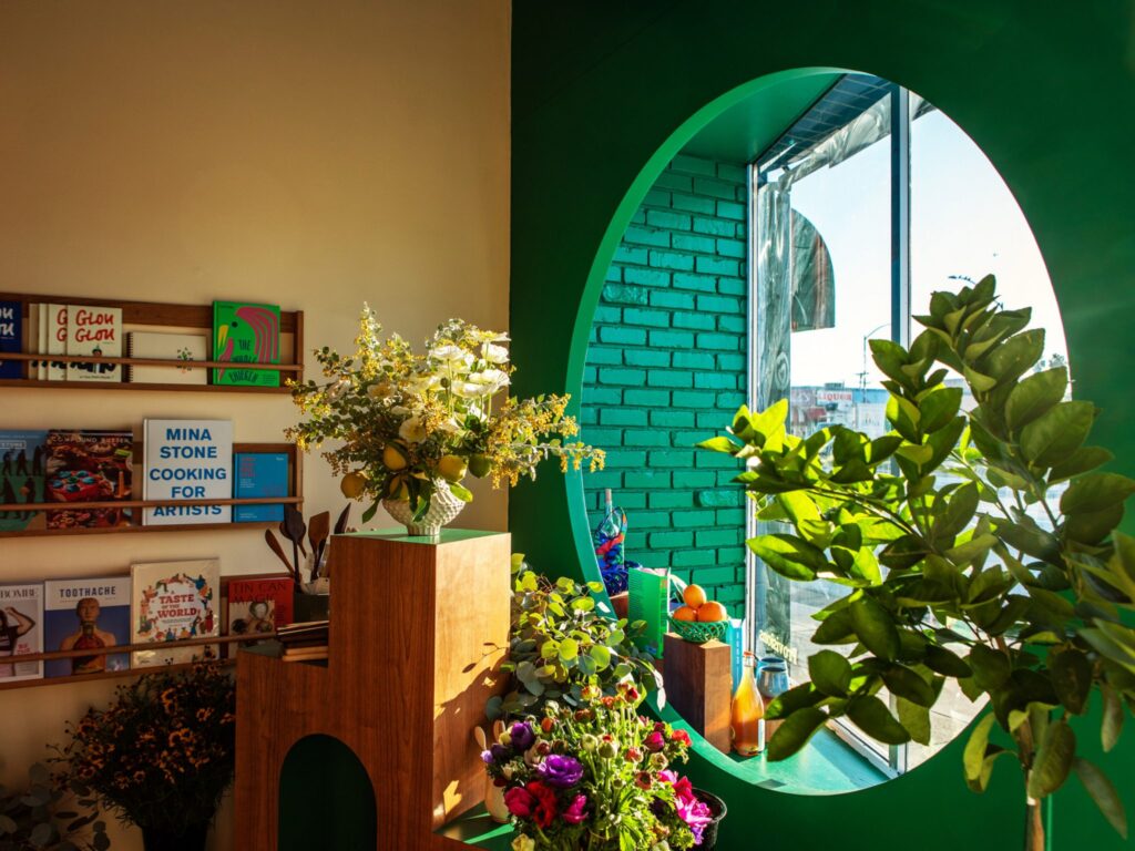
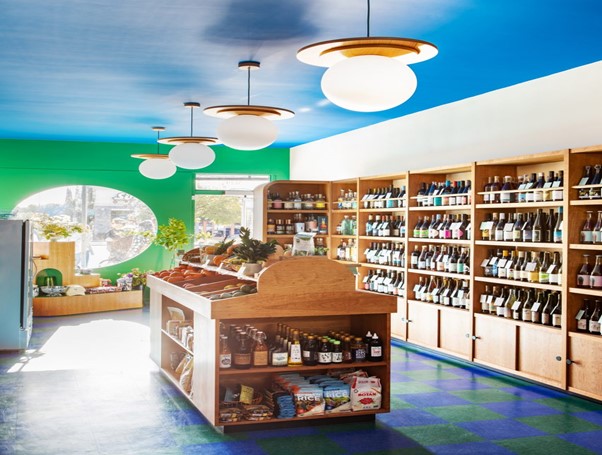
Wine and Eggs, US, by Adi Goodrich
Wine and Eggs is a Los Angeles grocery store with a checkerboard green and blue floor, designed by Adi Goodrich.
The hardwearing floor’s tones are echoed by a bright green wall featuring a circular window, and a bold blue roof, both of which were designed “as a monument to colour,” said Goodrich. The analogous colours also pick up the greenery that is dotted around the store in the form of plants and vegetables.
The shop’s interior was informed by eclectic European grocery stores. In particular Italian tobacco shops, and Parisian cafes and Portuguese storefronts.
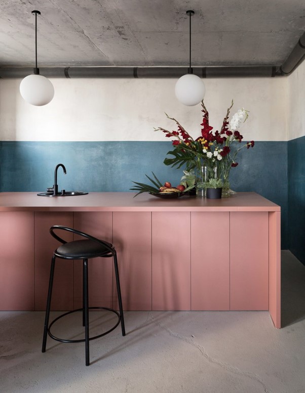
Minsk workspace, Belarus, by Studio11
In a more discrete example of how you can decorate with blocks of colours, Belarusian design firm Studio11 added strips of muted colour to the interior of their own workspace in Minsk, the country’s capital.
Flashes of plum and teal blue line the architecture and design office, which also features a pale pink kitchen island and rough concrete screed floors painted in a delicate shade of grey.
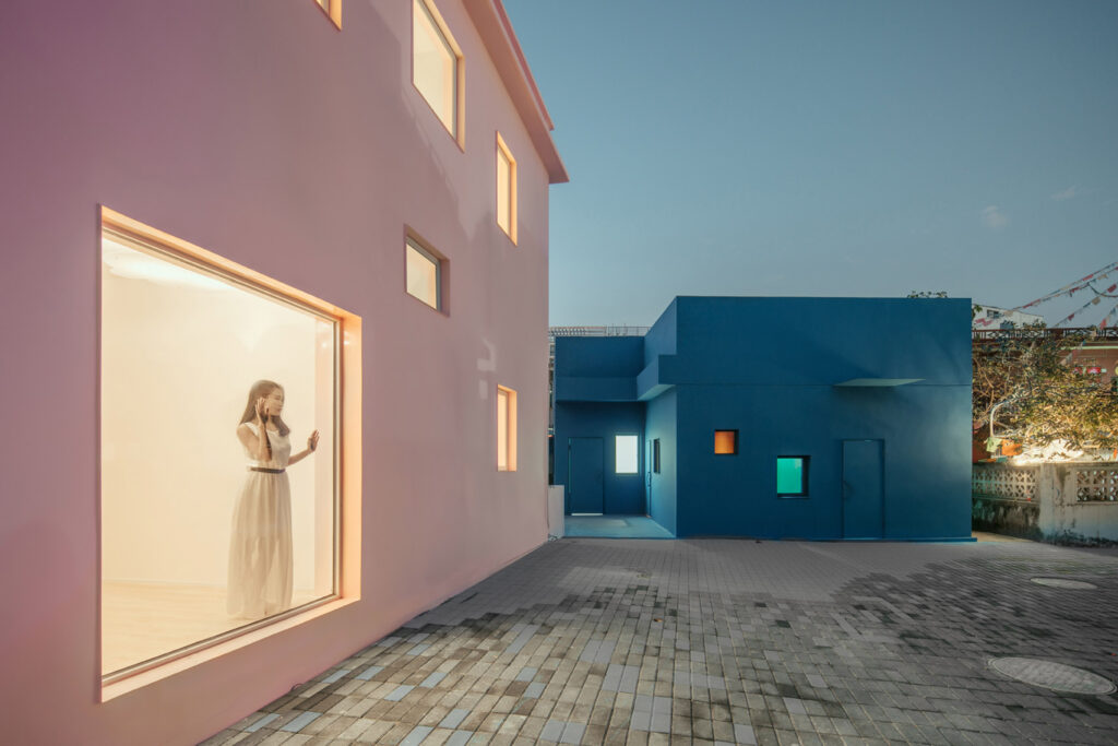
His House and Her House, China, by Wutopia Lab
Chinese firm Wutopia Lab renovated two houses in Dameisha Village, an urban slum, into pink and blue buildings designed to explore gender constructs for an architecture biennale in Shenzhen.
The houses themselves became separate blocks of colour, a theme that was also replicated in each building’s interiors. Inside the blue building, analogous green walls and blue ceilings were informed by the work of French artist Henri Matisse.
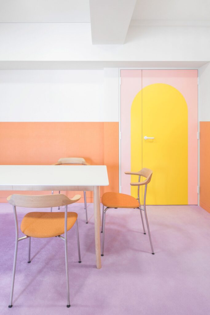
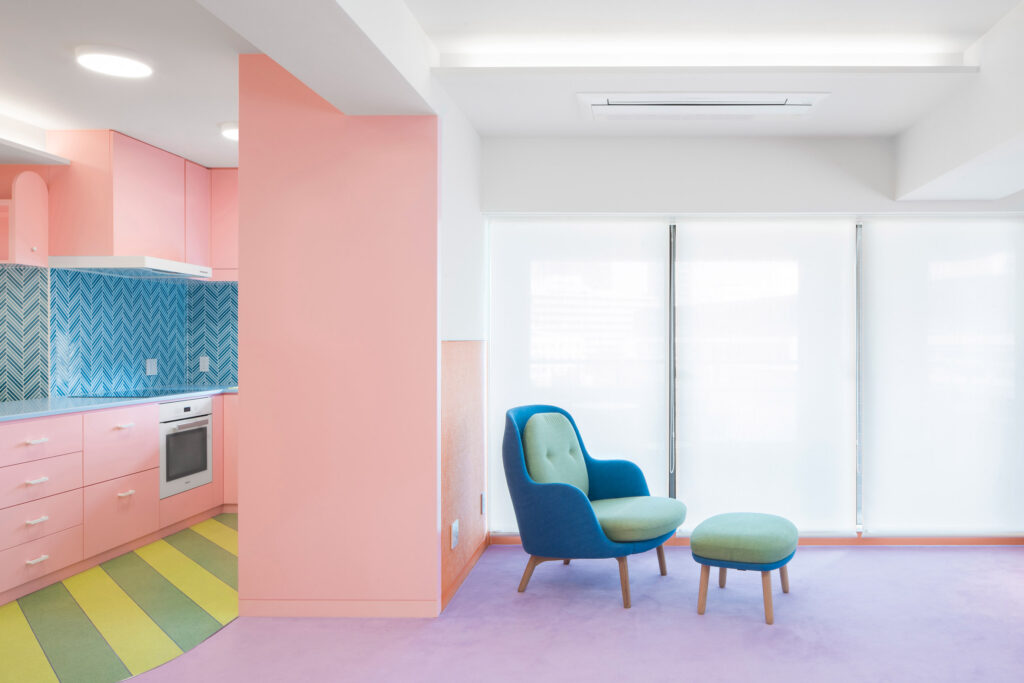
Nagatachō Apartment, Japan, by Adam Nathaniel Furman
A formerly “claustrophobic” Tokyo apartment was transformed by designer and colour-lover Adam Nathaniel Furman into a space defined by a sugar-sweet palette of shapes.
Complete with a lilac carpet informed by icing on a cake, the pastel apartment uses complementary colour-blocking for the bright, light yellow doors with a pale pink border.