Pantone – Colour Palette to Calm and Reassure


Clarify
A QUIET AND EASY COLOR PALETTE CALMS AND REASSURE
As the world moves forward though a global health crisis, we need a pure and cleansing palette for the making of pristine, unsullied, highly functional environments—safe spaces where we can move freely, breathe easily, and let our guard down.
Our desire for simplicity comes through in Clarify, a story of calm and meditative color featured in PANTONEVIEW home + interiors 2022, a palette whose airy nature rests on a practical foundation of finishes and materials that are not too fragile or ephemeral. Durable and lasting, a pragmatic group of color that contributes to our sense of well-being.

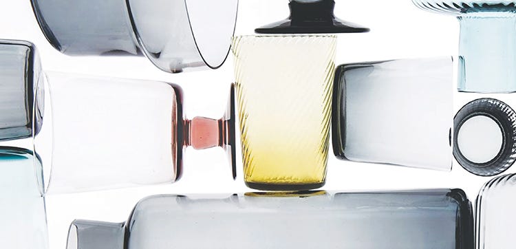
The colors of Clarify are evocative in both hue and name including Lilac Snow, Bay, Transparent Yellow, Pear and Nantucket Breeze. Bright White, the essence of clean, acts as a focal point, channeling reassuring and optimistic “fresh start” messages. Easy color combinations of these enlightened pastel shades spring up around a Bright White core, some with pearlized finishes and shine, some in transparent and translucent form, but all contributing to peaceful feelings. Lead Crystal, a shimmering, silvery metallic, suggests a see-through quality important to the concept of “clarifying.”

Excerpted with permission from PANTONEVIEW home + interiors 2022 – Involved, Resolved, Evolved
Source: https://www.pantone.com/eu/en/articles
