Camira Fabrics Trend Report
Reflect’s colour combinations
Reflect’s colour palette sets a feeling of wellbeing and honesty. The ten fabrics and colours offer a variety of compositions and showcase the depth of the palette.
- Raw luxury
The inclusion of cool and warm colours creates two micro palettes, where soft stone anchors each and offers a moment of calm.
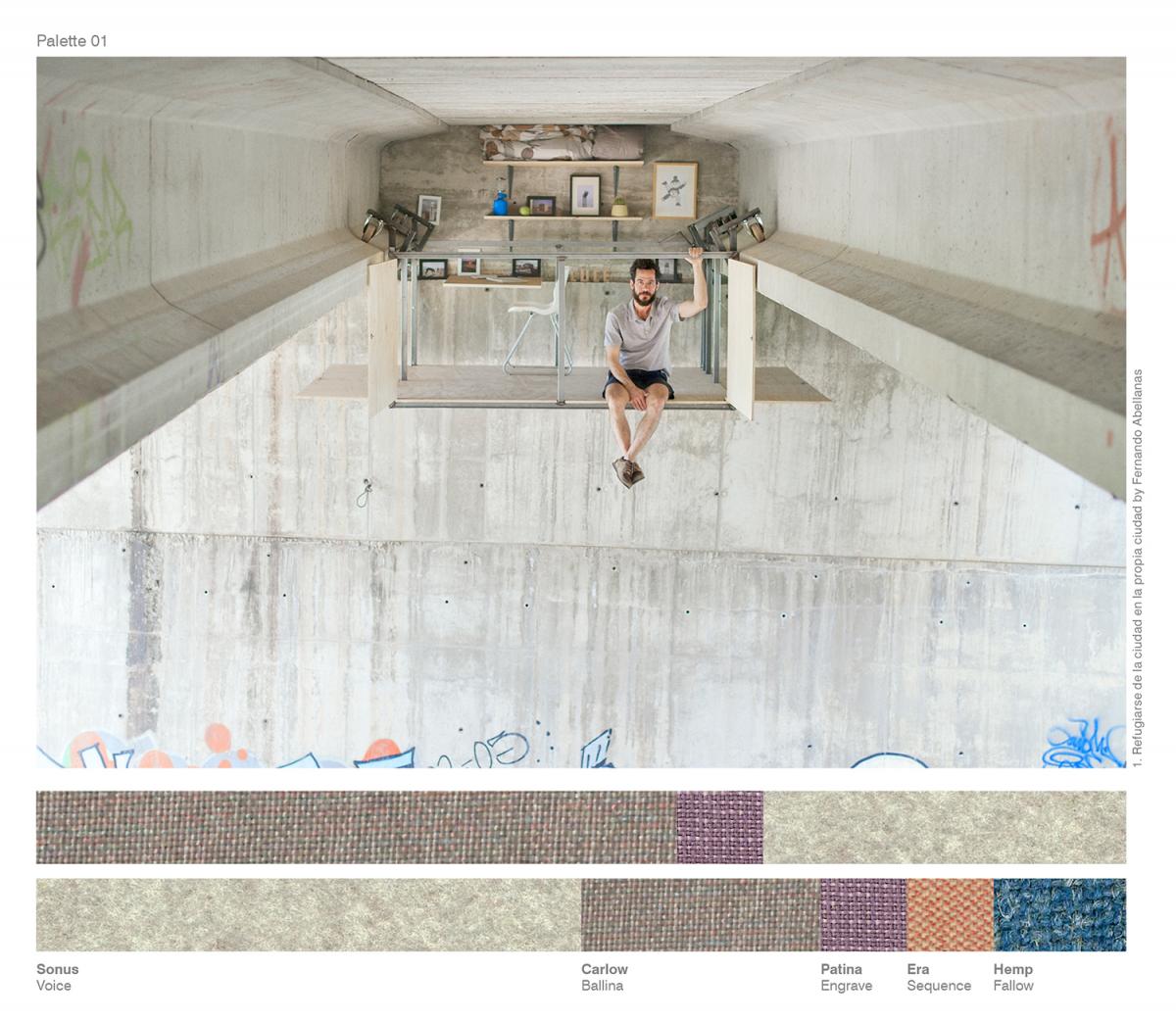
In the first palette hints of blue in the dusky purple and grey tones contrast the warmth of a sandstone hue. A pale grey on walls brings an urban edge to this story, complementing hazy purple-grey on upholstery and accents of the bolder purple for soft furnishings and trims.
A second version sees a more eclectic palette where textured blue and orange are introduced. To ensure the composition stays understated use a larger quantity of the sandstone on floors, furniture and walls to offset the richer highlights; introduce orange and purple on soft furnishings and trims to contrast the textured ink blue on upholstery and window treatments.

- Simple contrast
A striking look can be achieved from the simplest colourways and this example of deep green and rugged beige allows for the power of each tone to be fully realised.
Using a dominance of this rich but hazy green creates impact and can be enhanced by introducing the same tone on architrave and woodwork. Also consider different sheen levels across your interior scheme using the one colour and complete the look with upholstery in this raw and luxurious beige tone with its contrasting yarns.
For a more calming aesthetic choose equal amounts of the two colours but explore the subtle nuances of each fabric to discover accent colours. Dark grey highlights of the warm neutral can be carried onto other finishes such as flooring and soft furnishings to create a moody shadow effect.
- Soothing blends
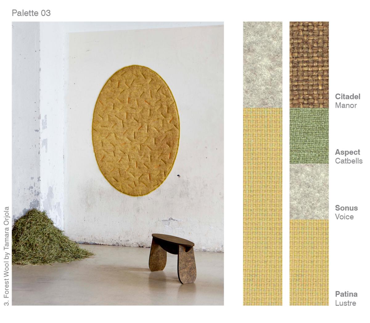
Organic colours never fail to bring a level of comfort and reassurance and here we see pale, mid and dark tones bring out the best in one another.
A two-tone scheme of sandstone and dusky yellow surrounds you in warmth and comfort, creating a gentle core palette. Focus on the softness of the yellow and its positive effects; embrace this sunny colour as a backdrop as well as a key furnishing fabric. Introduce the pale warm neutral tone on floors, ceilings and other upholstery to balance the look.
A selection of four natural hues is also effective. Using equal amounts of rich brown and dusky yellow creates stability as each colour offsets the other on floors and walls. With the desaturated quality of the green, it brings tranquillity to the scheme; consider this colour for key furniture pieces alongside accents of sandstone on soft furnishings.
Article Credit | www.camirafabrics.com | March 14, 2018 | Trend Report